Clickable zones
Interaction block Interaction blocks offer a choice to the learner. These blocks can have multiple outputs, and a different output may be triggered depending on the learner's choice. This allows you (the scriptwriter) to create a different Graph path for each choice. These blocks are only available within the Scene Graph.
Video Tutorial
Take your first steps with this block thanks to the dedicated video tutorial!
Find all the Virtual Training Suite video tutorials in your VTS Client Account.
youtube.com/watch?v=SbaRww5FpaE
Behaviour
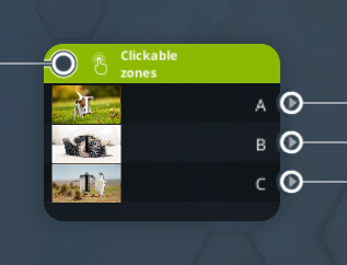
Before introducing this block, let's first go over the "zone" notion. It actually refers to a squared part of the screen defined by a position, a rotation and a size. This zone is displayed over the scenery elements, such as characters, but under the VTS Player interface (menus, inventory, conversation history, ...).
This block allows you to display such zones, which will be clickable by the user, in order to trigger events, or non-interactive displays.
Settings
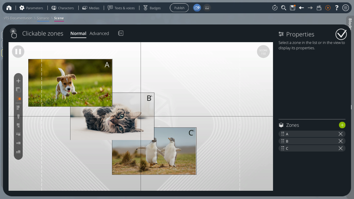
In Normal mode, zones are displayed instantly over the screen and the learner will be able to click on them to make a choice. The scenario will not continue until a zone is clicked by the player. Then, the linked output will be used and the zones disappears instantly. This mode looks like a Quiz but with choices defined as zones.
You might want to tell the player that they will need to click on the screen before going through this block. This block has no interface in VTS Player except the defined zones.
Many settings, which will affect the bloc behaviour, can be edited from the Advanced mode detailed further in this page.
Get back to the Normal mode won't reset the Advanced options. The block may behave differently of what is defined here if it has been edited in Advanced mode. The mode only hide or display those options in VTS Editor.
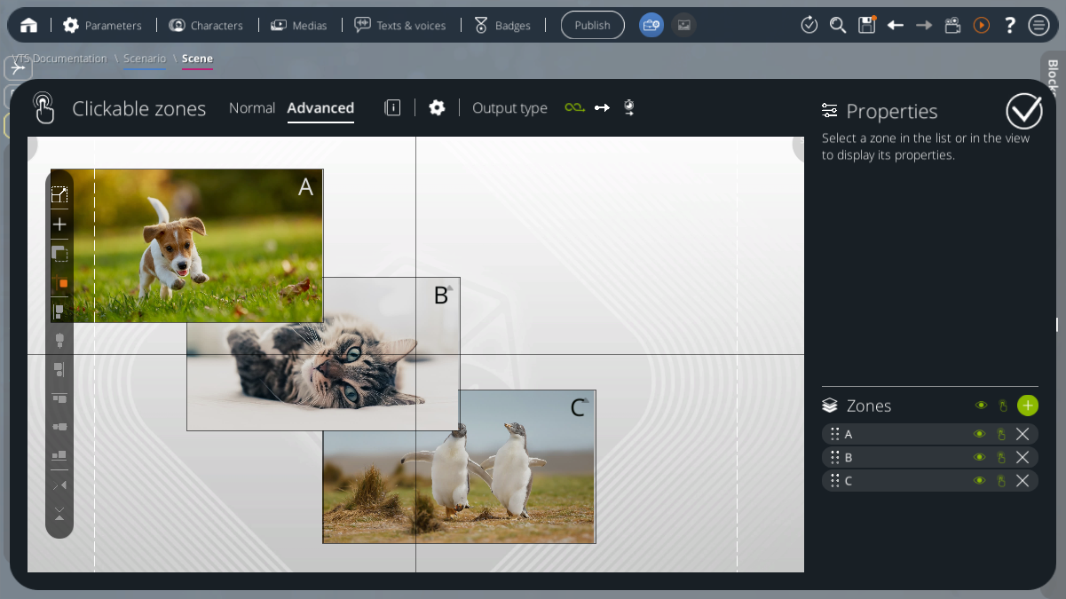
On the right of the scene preview stands a panel which contains the Zone Properties view, and below, the list of all zones defined in this block.
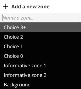
Zones list
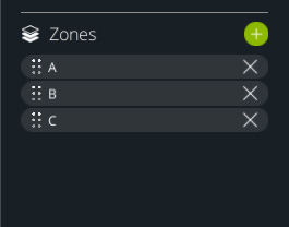
The [+] button will add a zone, which will appear in the left-hand side list, and will be displayed in the preview. Each zone can be named to help you match its linked output in the graph.
The zones are layered. The first elements of the list will be displayed over the next ones. You can reorder them with a drag and drop action. This will switch the zones order
A selected zone is always displayed over everything else. Unselect it to restore its depth.
You can delete a zone using its [X] button.
Preview
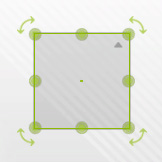
You can move the zones within the preview by dragging and dropping them, in order to place them wherever you want. You can select a zone by clicking on it in the list, or in the preview. The selected zone is displayed in green in the preview.
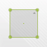
Four controls on the zone corners allow you to edit its size by dragging them. Some options can be edited through the green window displayed over it.
While moving or scaling a zone, VTS Editor will help you by snapping them to relevant values, as the screen center or edges, but to the other zones as well. This behaviour may be toggled by maintaining the "Alt" key.
You can deselect a zone by clicking outside of a zone on the preview, or by clicking at the bottom of the zones list.
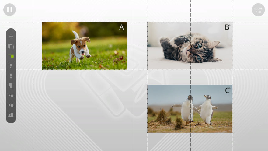
The two vertical white dotted lines (visible on the left and right of the scene preview) indicate the limits of a 4:3 screen format, such as an iPad. If you plan to deploy your module for a 4:3 format, you have a choice to make between the following two options:
- Design your clickable zones directly to fit the width of a 4:3 format, so stay between these two dotted lines.
- Design everything in 16:9 format, therefore using all the space available in width, and activate the option "Force 16:9 on mobile" in the advanced general settings of the project. This option adds two black bands at the top and bottom, so that the display will fit in a 16:9 format that will not be truncated by the left and right edges of the screen.
Toolbar
On the left stands a bar with several useful tools :
 |
Add a new zone | Create a new zone, as if it was created from the zones list. |
 |
Duplicate | Duplicate all selected zones as new ones with same settings. |
 |
Enable/Disable the snapping effect | Enable or Disable the snap effect to position more precisely a zone. This can also be triggered by maintaining the "Alt" key. |
 |
Left alignment |
Align a zone to the left of the view. |
 |
Center alignment |
Align a zone to the horizontal center of the view. |
 |
Right alignment |
Align a zone to the right of the view. |
 |
Top alignment |
Align a zone to the top of the view. |
 |
Middle alignment | Align a zone to the vertical center of the view. If several zones are selected, align all selected zones to the vertical center of the selection. |
 |
Bottom alignment |
Align a zone to the bottom of the view. |
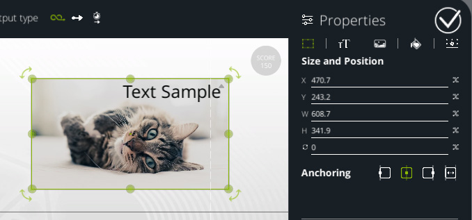
Properties - Size and Position
When a zone is selected, its properties displays on the right panel. This view is composed of several tabs and can be folded to extend the zones list part.
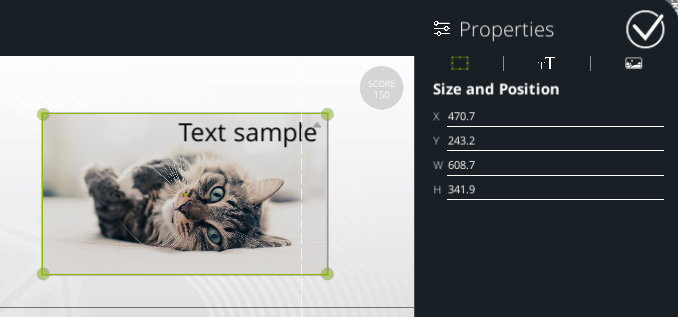
The "X" field defines the horizontal position of the zone. 0 stands for the screen center.
The "Y" field defines the vertical position of the zone. 0 stands for the screen center.
The "W" field defines the zone width.
The "H" field defines the zine height.
Those values are peculiar. As VTS Player may be displayed in several screen resolutions, this coordinates system consider the screen to be 1920px wide and 1080px tall, which allows those values to be relative to the screen size. This way, a X value of 960 which is half 1920 will center the zone on the right edge, whatever the final screen resolution is.
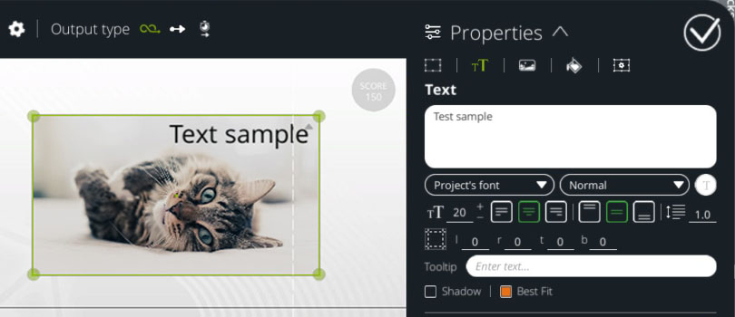
Properties - Text
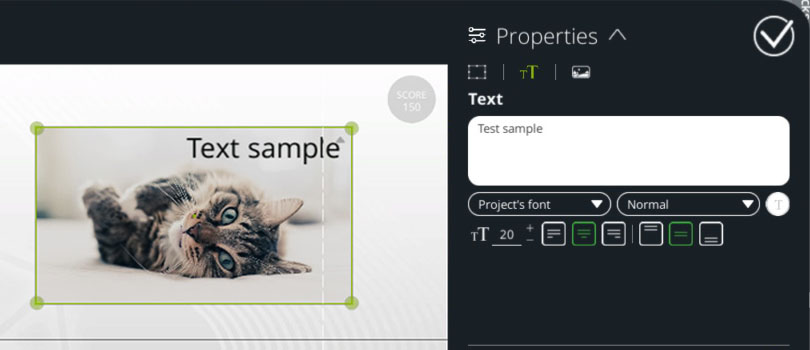
You can define a text which will be displayed over the zone in this tab. You can also define the text font (by default it takes the one defined in the project), style (bold, italic, bold and italic, light), color, size and horizontal and vertical alignment.
The text size depends of the final screen resolution too, as the Position and Size properties.
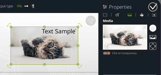
Properties - Media
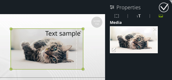
You can assign or remove here a media to the zone. As you assign a media in a zone, the zone will stretch horizontally to match the given media aspect ratio.
If a media is set, the zone scaling behave differently. By default, the scaling keep the media aspect ratio. You can toggle off this behaviour by maintaining the Shift key. In this case, the media will fill entirely the zone, croping its overflowing edges.
Shortcuts
For each shortcut, replace the Ctrl key by Cmd if you are on MacOS.
With the command Ctrl, you can select several zones by clicking on them. This allows to move them together in order to keep the space between them.
Ctrl + C copy the selected zones to an internal clipboard.
Ctrl + V will paste the copied zones :
- If the copied zones are the sames as the selection, zones are duplicated. Duplicated zones are shifted 30 units to the right and down. To cancel this effect, use Ctrl + Shift + V instead.
- If the selection is empty, new zones are created.
- If only one zone was copied and one other zone is selected, the settings of the copied zone will be applied to the other (position, size, media, text, ...). There is no new zone in this case.
It's not possible yet to copy multiple zones settings at once.
Ctrl + A select all this block zones.
Ctrl + D duplicate the selected zones. Duplicated zones are shifted 30 units to the right and down. To cancel this effect, use Ctrl + Shift + D instead.
Suppr or Basckspace will delete the selected zones.
Maintaining the Alt key will toggle the snap effect while moving or scaling a zone.
Maintaining the Shift key will toggle the keep ratio effect while scaling a zone.
Double-click on a zone to open its Text properties.
Right-click on a zone to open its Media properties.
Advanced Level
The advanced mode allows you to get out of the "mini-game" aspect, in particular by allowing you to keep the zones defined on the screen and continue your Scenario, a little like the Foreground block. Let's see all the additional parameters to which this level gives access.
Many additional options are now visible.
Block Options
On the right of the block title, there is a gear icon which opens the options panel.
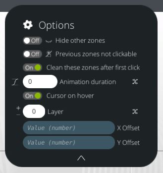
Hide other zones
on If others zones are still visible once this block is reached, they will hide as the ones defined in this block appears. off Thoses zones won't be affected.
Previous zones not clickable
on If others zones are still visible once this block is reached, they can't no more be clicked. off Thoses zones won't be affected.
Clean these zones after first click
on Clean all the zones defined in this block when one of them is clicked. off Keep all the zones activated when any output is triggered.
If zones are still visible even after one is clicked, click again on this zone will trigger the output a second time. So you may have to deactivate the zones directly after each output to avoid this. This option allows you to automatically hide and deactivate all the zones defined in this block when one of them is clicked. We will see later how to deactivate zones one by one.
Cursor on hover
on All clickable zones will change the mouse cursor when it is over the zone. This gives an indication to the learner that this screen part can be clicked. off No visual indication on the mouse cursor.
Animation duration
This field allows you to set the transition duration. A zone that was not visible will fade in, and a zone that was visible will fade out. The animation will also take in account any position, size, rotation or color changes.
The displayed media and the text content, font size and position are not animated and will be replaced instantly at the beginning of the animation.
On the left, you can edit the animation movement speed.
 |
Linear | Animate with a constant speed (without smoothing the start and end) |
 |
Smooth | Animate with a acceleration and deceleration effect (smoothing the start and end) |
Layers
Since VTS Editor 6.1, a system of depth levels called "layers" has been added. This layers are used to group the interactive zones, to condition more easily the display order. Thus, all the areas modified by this block will be added to the set layer level, which will always be displayed below the upper layers, and above the lower ones. This is especially useful to ensure that specific zones are always displayed above the others, without having to enter them again in a block to manage their display order.
X and Y translation
The variable values entered in the X and Y translation fields will apply an identical translation to all the zones of the block. Useful to move all the zones of a block according to a variable.
Example: if you enter 100 and 200, all the zones will be moved 100 units to the right and 200 units up. These values can be the result of a variable expression.
Output type
On the gear icon right, stands the output type option.
 |
Wait for input | Waits for one click on a zone to leave this block. The first output will not be available (except special cases). |
 |
Instant | Adds an output on the top of the block which triggers instantly when the block is reached. |
 |
Wait the animation | Like the "Instant" output type, this triggers the first output but only after the animation is finished. (see the Animation duration part below) |
The Instant and Wait the animation outputs allows the graph to continue playing, so other blocks can be executed even if some zones are still visible. This implies some important considerations that you must not forget when you use this block.
Once a zone is clicked, the Scenario is interrupted as it may be done with the Teleport or Timer block. The Scenario is stopped, goes back to this block and triggers the output linked to the chosen zone.
Zones list
Add a zone
 |
Some zones can already be displayed when you enter this block. In this level, instead of adding a new zone, the "+" button will open a panel where you can choose to create a new zone or select a previously defined one to be able to hide or edit it. You'll see in the choices the zones name you defined previously. You can also search a zone by its name using the filter field. If the filter does not return any result, the "Enter" key will create a new zone named as the filter. |
If you set a zone name in a block, it will be applied to all blocks. When you change the name of a zone, make sure that this name is not already used by another one. If this happens, a warning icon will appear to the left of its name.
As the graph is not linear, it is not possible to display the previous zone states in the inspector. However, when you add a previously defined zone to this block, it will be added with the same settings as the last time this zone was selected.
Search
 |
Opens a window listing all the uses of this zone in all the blocks in this scene. Allows to see which other blocks interact with this zone and to navigate quickly through them. |
Display / Hide
 |
The zone is visible and will appear on the screen in VTS player and the preview. |
 |
Hides and Deactives this zone. It will disappear from VTS player and the preview. |
Clickable / Informative
 |
The zone can be clicked to trigger the associated output. |
 |
The zone cannot be clicked. It is no more associated to an output. This is used to display information such as text or media to the learner. |
A non-clickable zone will not apply any change on the mouse cursor when it is hovered.
A non-clickable zone displayed over a clickable zone will not prevent the player from clicking on the one that is underneath.
A hidden zone cannot be clicked.
Preview
You can now edit the width or height of the zone, affecting its aspect. You can also rotate it with the four controllers added to its corner.
Toolbar
 |
Fullscreen view | On top, there a is button to switch to the fullscreen view (detailed below) |
|
|
Media inversion |
On the bottom stands two buttons to flip horizontally or vertically the media in the selected zones. This does not work with videos. |


Fullscreen mode
In this mode, the view and the properties panel are extended to be displayed fully in VTS Editor window. You can also zoom in and out the preview to place more precisely your zones.
The "F" key recenter the view.
The "Escape" key will quit the fullscreen mode instead of quitting the bloc edition (click back on the fullscreen view button in the toolbar also exits this view).
Properties - Size and Position
In advanced mode, a new field is added which manages the zone Rotation in degrees.
Variables - Available in INTEGRAL pack
You can also assign variables expressions to those fields. Those values will be calculated from their expressions when this bloc is reached in VTS Player.
Anchoring
You can anchor a zone to one or multiple screen points. Two modes are possible : the "Simple" anchor will position a zone depending on a specific edge, and the "Stretch" anchoring which will adapt from the screen width.
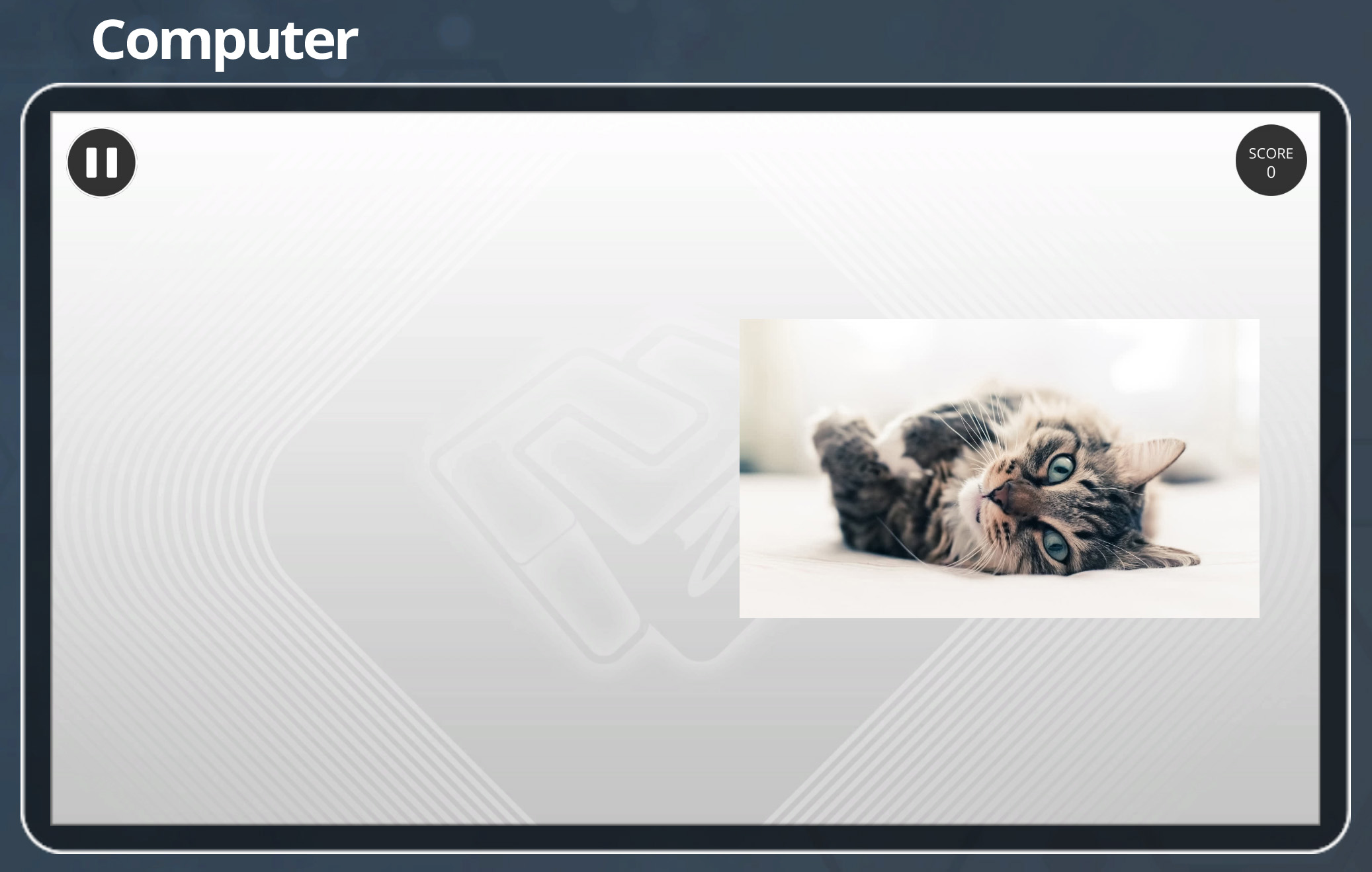
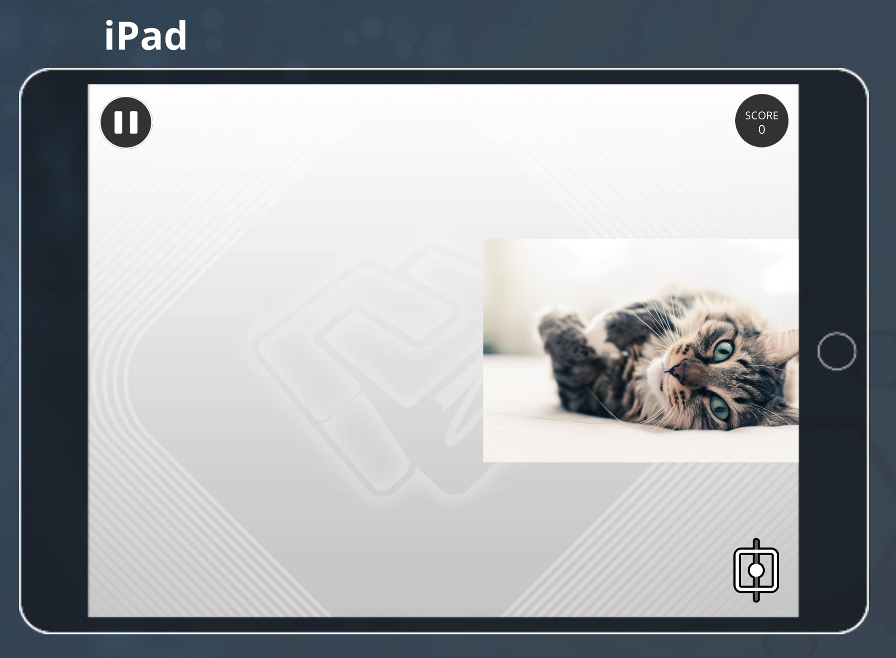
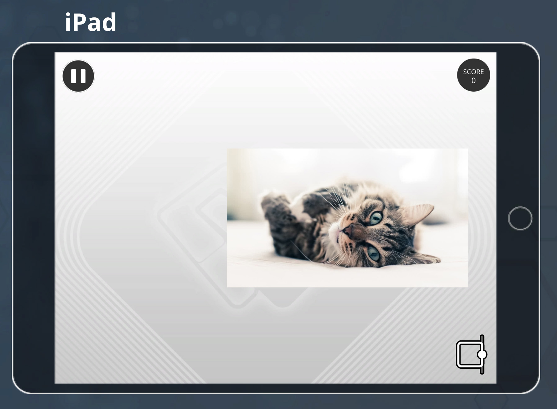
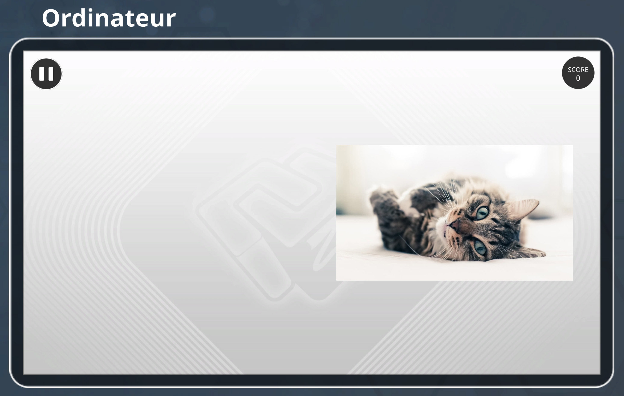
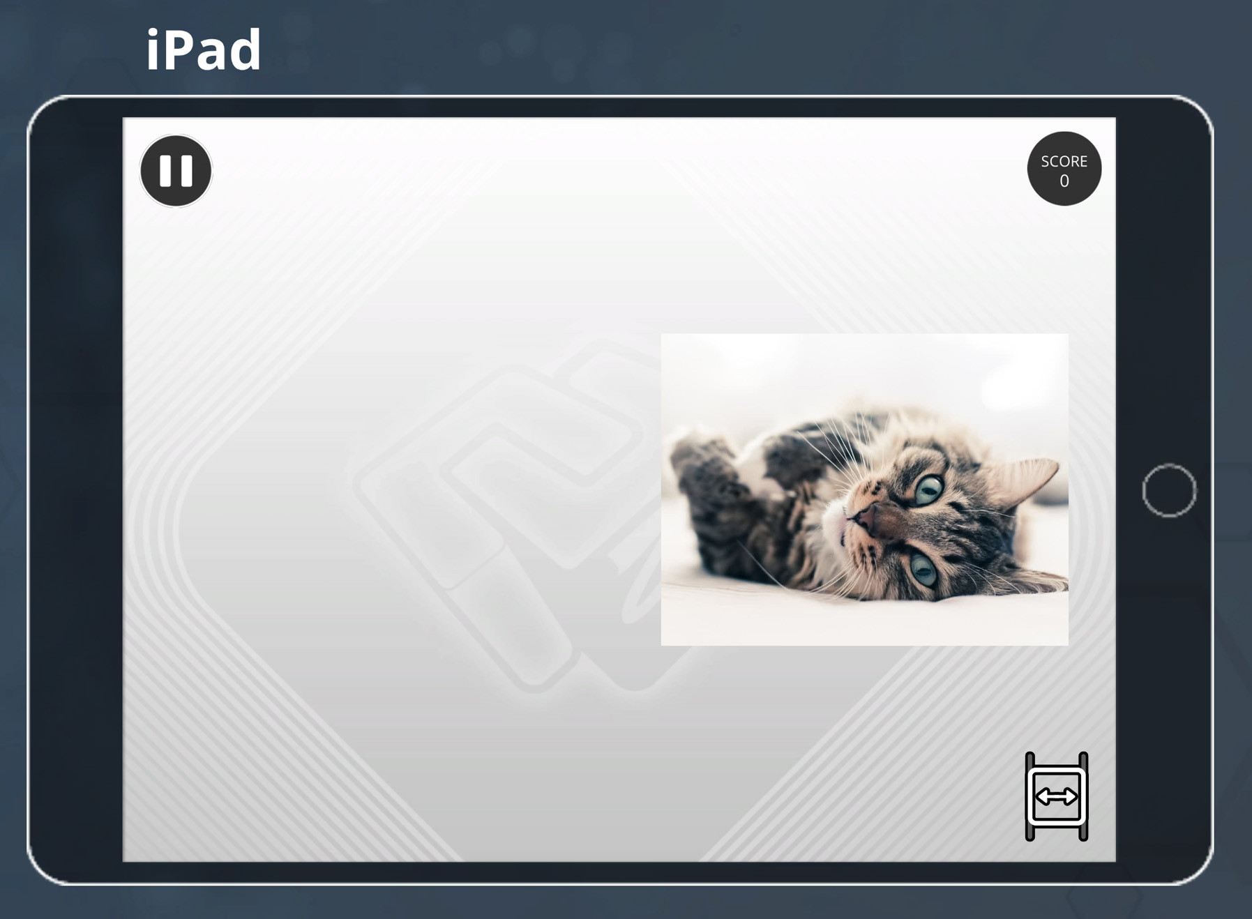
This anchroring system is useful to adapt the zones to the different devices screen resolutions, as for iPad which are mostly in 4:3 format. A zone positions differently depending on its anchor setting :
 |
Anchored to the left | The "X" field stands now for the distance between the zone and the screen left edge. The value 0 will stick the zone on the left of the screen. |
 |
Anchored to the center | The "X" field represents the zone offset from the screen center. The value 0 will center the zone on the screen. |
 |
Anchored to the right | The "X" field stands now for the distance between the zone and the screen right edge. The value 0 will stick the zone on the right of the screen. |
Example :
 |
 |
 |
| Generic view (16:9) |
iPad view (4:3) anchored to the center. |
iPad view (4:3) anchored to the right. The zone has moved to keep its distance on the right side. |
 |
Stretched | With this option, the zone will scale horizontally to keep the distances between the left and right edges. Be careful that a zone may have this way negative size values. The "X" field becomes a "L" field which stands for "Left spacing". The "L" field becomes a "R" field which stands for "Right spacing". |
Example :
 |
 |
| Generic view (16:9) | iPad view (4:3) stretched. The zone is scaled down horizontally and crop its left and right parts. |
Properties - Text
In Advanced mode, you can also :
- edit the text interlining,
- add an offset to excenter its position,
- add an another text which will be displayed in a tooltip when the learner hovers the zone with its mouse.
- add a shadow effect,
- allow it to scale down its size to be fully displayed in the zone and not cropped.
The Bestfit option is here to ensure the text to be fully displayed in the zone. It can only lower the text size.
Properties - Media
 |
Hue | Apply an additional color to the media. White color will not change it. |
 |
Restore Ratio | Edit the zone width to restore the original media aspect rattio. This can only be done if a media is set. |
 |
Restaurer taille originelle | Applique la taille originelle en pixels du média aux champs Largeur et Hauteur. |
Click on transparency (only if the media is an image)
on The learner can click on all the zone to trigger it. off The learner have to click on a non-transprent part of the media to trigger the zone.
This option does not allow to click on another zone under it.
Loop video (only if the media is a video)
on Loops the video when it ends. off The video is played only once.
Hide on video ends (only if the media is a video)
on Hides the zone once the video is finished. It is then no longer clickable. off The zone is not automatically hidden. This option is always OFF if the option Loop video is activated.
Properties - Style
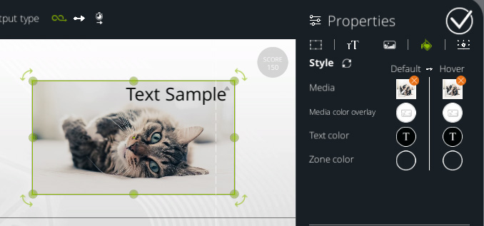
This window allows you to edit the zone display, its changes whenever the mouse cursor hovers over the zone. Whenever it happens, the zone will change its "state". The default state is named "Default". When the mouse hovers over it, its state switches to "Hover". When it goes out of it, the zone is switched back to "Default".
The Hover state is not visible when the item is selected in the preview.
If the zone cannot be clicked, the Hover state will never be set and the Style button will n
For each state, you can edit the media, its color, the text color and the zone background color. The text, media and media color refers to the same ones that are defined in the Text and Media panels.
The media field allows you to modify the media displayed, especially during the "Hover" state. If it does not match the "Default" media ratio, then it will fit in the zone (stretching to be fully displayed in the zone).
The zone background color refers what is displayed if there is no media or if the media contains transparency, and will be displayed on the zone background. This can be used to create UI buttons, or to indicate to the learner the zone that can be clicked by tweaking the alpha value.
Between the two styles buttons, the arrow button will set all Hover settings to match the Default style. This is used to reset the visual changes between those two states.
Whenever the Default settings are modified, if there was no difference between those states, the changes will also be applied to the Hover state.
Properties - Advanced
Variables - Available in INTEGRAL pack
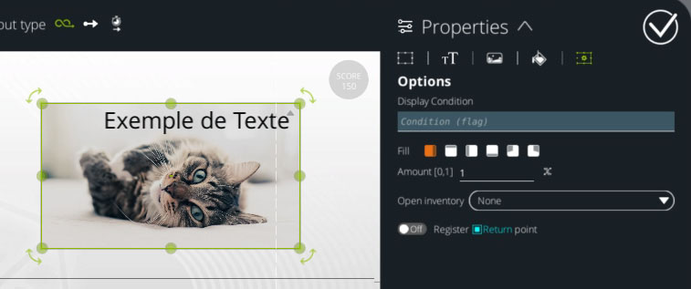
A Variable expression can be set in the Condition field and its value will condition if this zone is displayed or not.
A Fill field that allows you to hide a part of the area. This field consists of two parts. A list of filling modes listed below, and the filling amount which must be between 0 and 1, 0 meaning that the media is completely hidden and 1 that it is completely displayed.
- Horizontal : The zone is displayed from the left to the right.
- Vertical : The zone is displayed from the bottom to the top.
- Reversed horizontal : The zone is displayed from the right to the left.
- Reversed vertical : The zone is displayed from the top to the bottom.
- Radial : The zone is displayed in a circular, clockwise direction.
- Anti-Radial : The zone is displayed in a circular, anti-clockwise direction.
The Open inventory field allows you to display an inventory item in full screen, when clicking on this zone without triggering an output in the graph (so as not to leave the current location). The zone must be configured as clickable, but it will then have no associated output. This allows to simply give access to resources in the inventory via custom buttons, without losing the progress in the scenario.
There is also an option to save the block that is currently stopped when this Zone is clicked as a return point for the next Return block. This allows to create temporary sequences and easy return to the scenario by ending these with a Return block.
Specific Cases
This block works as a "Connect" block if no zones are defined.
The output type "Wait for input" works only if there is at least one clickable zone defined in the block. Otherwise, the "Instant" output type will be used.
Remember that this block acts as a teleport block, and will stop your scenario to go back to this block. Therefore, you may want to avoid defining a zone that will be displayed during the whole scenario.
- ${ child.title }